Title Wall Design Images
Title Wall Design Images
In Honor of Plywood
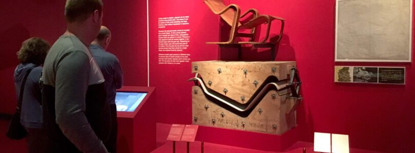
We take plywood for granted, but since the 1850’s it has literally shaped contemporary design. “Plywood, Material of the Modern World” at the V&A London, tells the little known story of this common material. The exhibition design makes good use of the same material it celebrates. Fiberglass coated entry walls with a slick “surfboard” feeling open into an intensely red space. Exhibi...[Read More]
Science Museum Tips: MORE On Naming an Exhibition
EXHIBIT TIPS FROM AROUND THE WORLD This is an extended version of an article that appeared in the January/February 2014 issue of ASTC’s Dimensions magazine MORE ON NAMING AN EXHIBITION Naming is one the most difficult steps in the process of creating an exhibition, especially because it is for a “lifetime.” It’s like choosing a name for a child—it involves many ideas and many more advisors. ...[Read More]
Science Museum Tips: On Collaborating Successfully with Clients and Partners
EXHIBIT TIPS FROM AROUND THE WORLD This is an extended version of an article that appeared in the January/February 2014 issue of ASTC’s Dimensions magazine ON COLLABORATING SUCCESSFULLY WITH CLIENTS AND PARTNERS Having worked for 10 years in museum education, I am familiar with the high level of collaboration between organizations needed to create meaningful exhibits and partnerships. Howeve...[Read More]
Science Museum Tips: On Designing Digital Games
EXHIBIT TIPS FROM AROUND THE WORLD This is an extended version of an article that appeared in the January/February 2014 issue of ASTC’s Dimensions magazine ON DESIGNING DIGITAL GAMES Future Energy Chicago is a games-based simulation at the Museum of Science and Industry in which players collaborate and compete to create an energy-efficient landscape for Chicago. Playing in teams, visitors ca...[Read More]
Science Museum Tips: On Prototyping
EXHIBIT TIPS FROM AROUND THE WORLD This is an extended version of an article that appeared in the January/February 2014 issue of ASTC’s Dimensions magazine. Kari Jensen, senior exhibit developer, Oregon Museum of Science and Industry, Portland ON PROTOTYPING The Museum of Science, Boston, has been prototyping extensively since the 1980s. We have experimented over the years with various ways ...[Read More]
Portlandia Nails Labels, It’s Time to Label Your Life!
Hi All, Are you guilty of labeling your life? Have you cut vinyl from scraps from work for your flour and sugar jars, or made labels for art on your wall? Have you been accused of doing worse? Please share your adventures in labeling below and enjoy Portlandia’s spot on presentation of this obsession.
Hide-a-Cord Can be Busy or Ugly, Why Not Gaff the Crack?
Hide-a-cord has it’s place in life and is an essential tool in the technician’s toolbox, but it can add a bit of presence on the wall. You can paint it to match of course, but it’s still there. Here’s our process for making most of the power cord disappear or at least be as elegant as possible. Run the Architecture Where You Can We use the 1/4″ channel at the bottom o...[Read More]
Attention to Detail Makes Me Smile
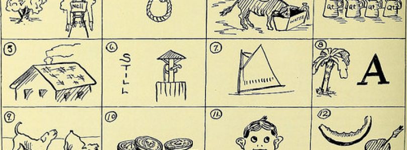
Photo by Internet Archive Book Images
Painting Tip (newer buildings)
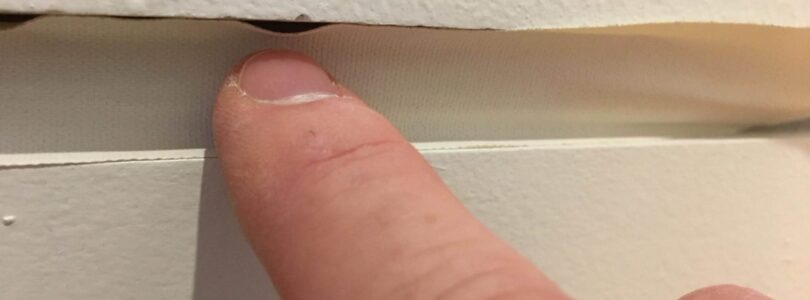
DO YOUR WALLS HAVE A SMALL REVEAL AT THE BOTTOM? HERE’S A PAINTING TIP FOR QUICK AND QUALITY COVERAGE. Whether you like it or not sometimes we all have to paint walls. If you are lucky enough to be in a building or expansion that is relatively new you just might have a small reveal at the bottom of the wall instead of a fancy baseboard moulding (see pictures). If this applies to you ...[Read More]
The Art of Installation
Four photos; of two museum preparators installing three Duane Hanson figures. The three Hanson sculptures, with their sawhorses and scaffolding are stationary, but the photos, taken from different angles, create an illusion of movement. The only changing elements are the two museum preparators at work. Artist Sharon Lockhart staged this photoshoot during the installation of Hanson’s Lunch Break, 1...[Read More]

