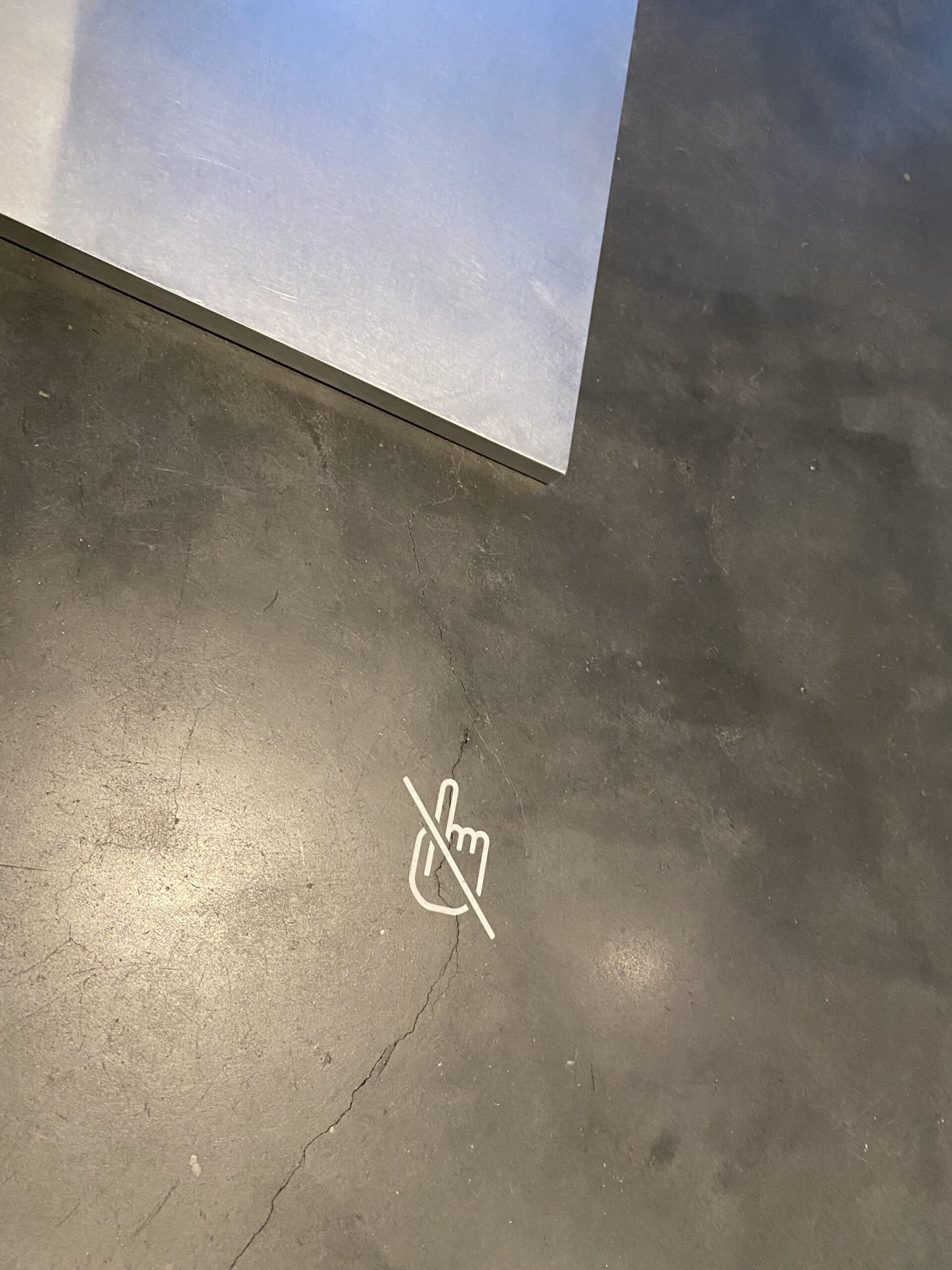
Yeah, Mr. MC Hammer said it best “You can’t touch this!”. How do you Do Not Touch? It’s an uphill battle, always. I was fortunate to get a tour (thank you Matt & Edwin) of the Los Angeles County Museum of Art (LACMA) last month and ran into this “do not touch” sign. My apologies for not being a crack reporter and investigating fully, there was so much to take in, I think it’s vinyl.
Gallery signage at large is fraught with opinions and DNTs, as I call them on my computer, are no exception. Make them too big and it distracts from the object at hand. Make them too small or too infrequent and they’ll be overlooked and those curious fingers and hands will come. You could add a guard or interpretive member to each room, but who has a budget for that? There’s no easy answer.
I’d say this was a handsome sign. It was big enough (apologies for not getting an overall shot of the sculpture) as compared to the work and it contrasted well enough with the floor. I feel like, if memory serves, it was only on one side? The front side. I would be tempted to do this on all four sides, but I’m sure there are 43 opinions just within the museum on this, that would be 43 million world wide. We do the best we can right?
So, does this sign work? Well, in the 5 minutes near this sign no one touched the work. Has anyone done an all-day evaluation to count the times it’s touched, probably not. I read that in advertising you need to reach a potential customer seven times before they take action. I’m of the mind that the more times we post (with aesthetics in mind) a do not touch sign in our galleries the better our chances of preserving the objects.
What say you? What does your do not touch signage look like in your museum or gallery? Are preparators, handlers, and technicians in charge of design and production or is another department? What kind of gallery signage is working best for you? What gallery signage designs are NOT working?


