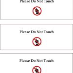
Locked eyes on this sign as it was hanging in the second floor galleries of the Last Bookstore in Los Angeles. The placement might not fit at a museum, but let’s think with this approach to communication. I feel this much more than the “touchy subject” genre of wall texts that attempt to dissuade our more tactile friends through the use of complete sentences, piling up into lengthy paragraphs, all set in glorious grayscale. One of the impulses that could lead someone to touch a work of art is feeling like their eyes were just drawn to it. How can we draw those same eyes to a clear message?
Latest posts by carl schmitz (see all)


