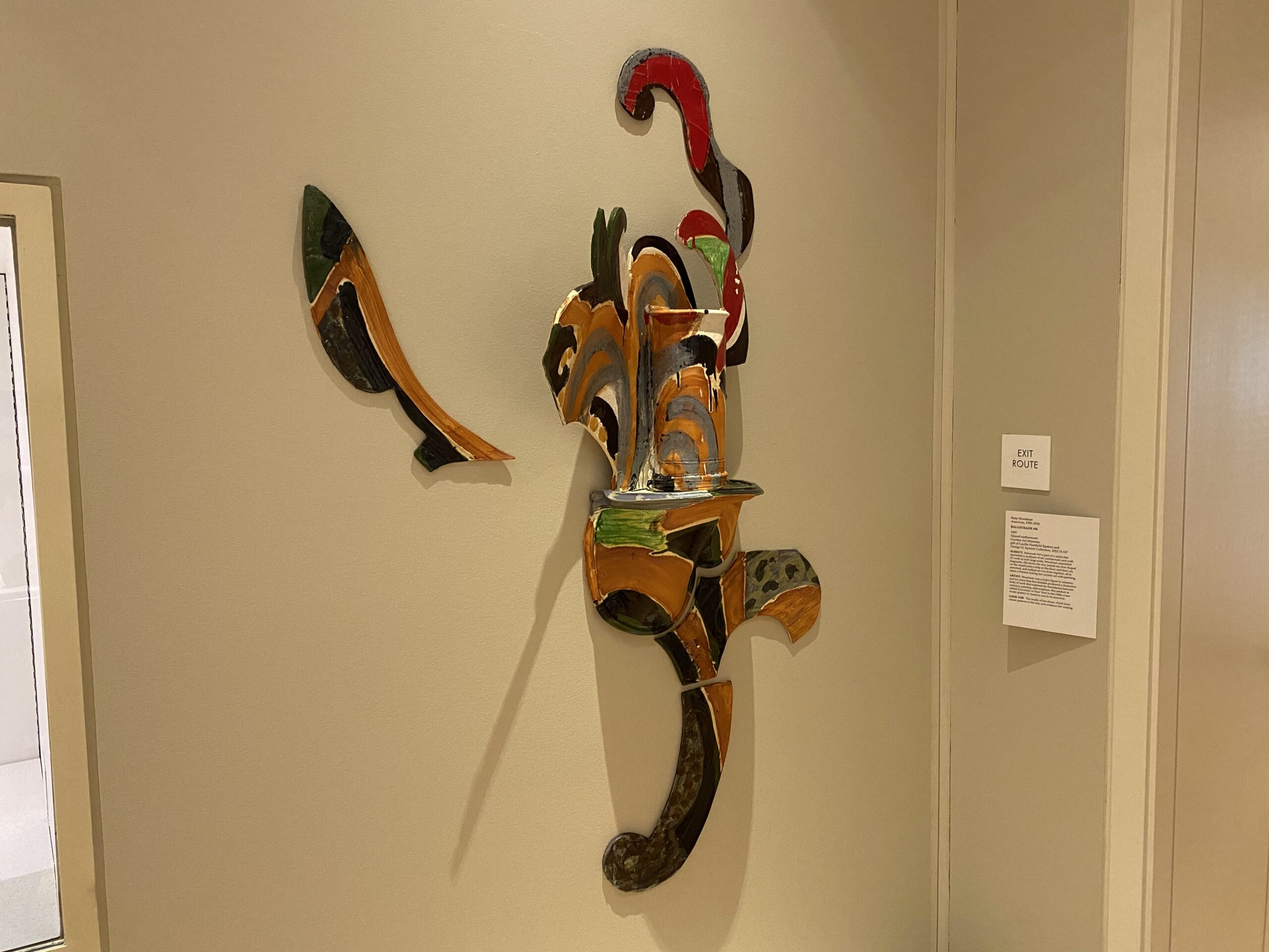
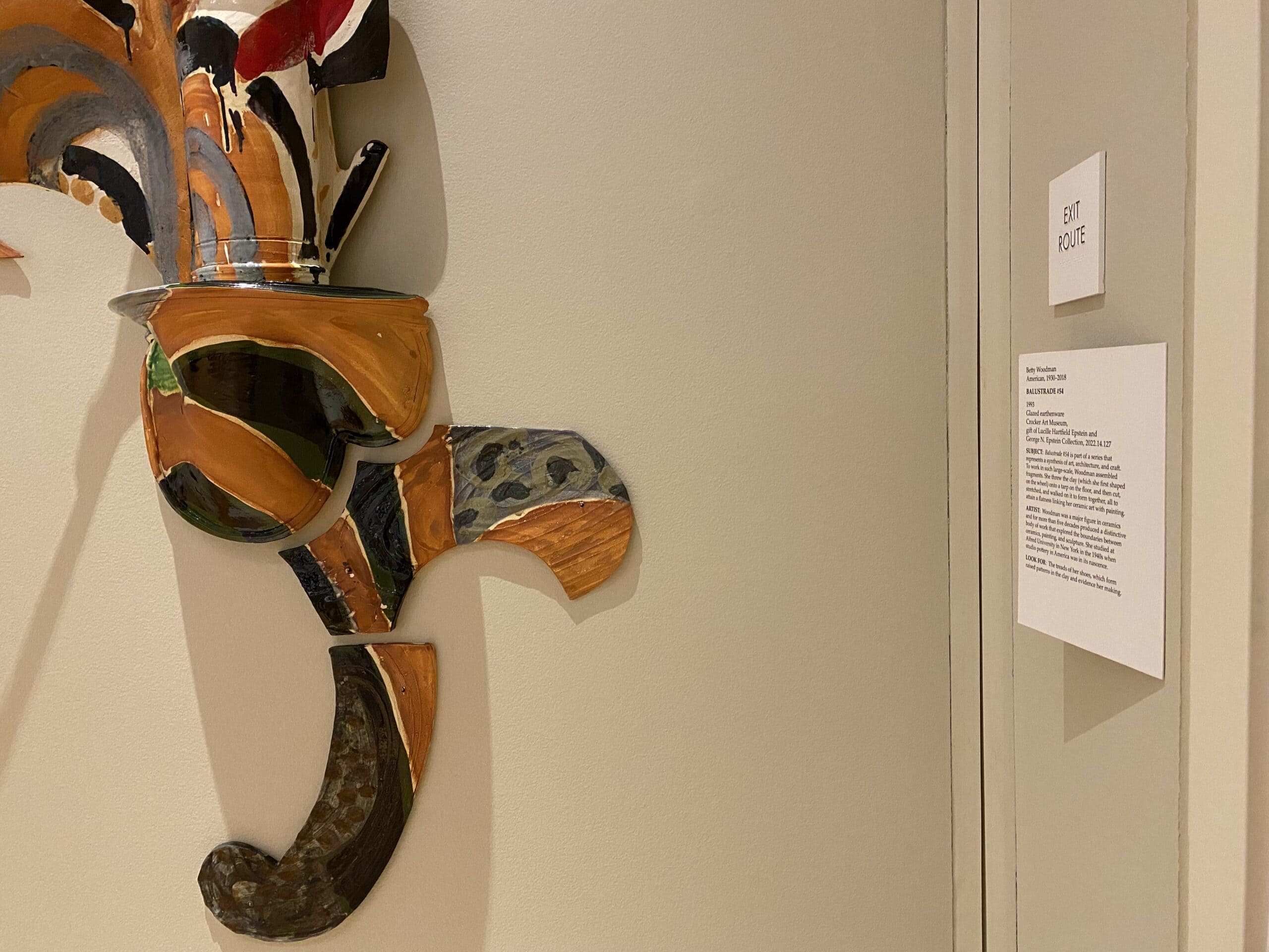
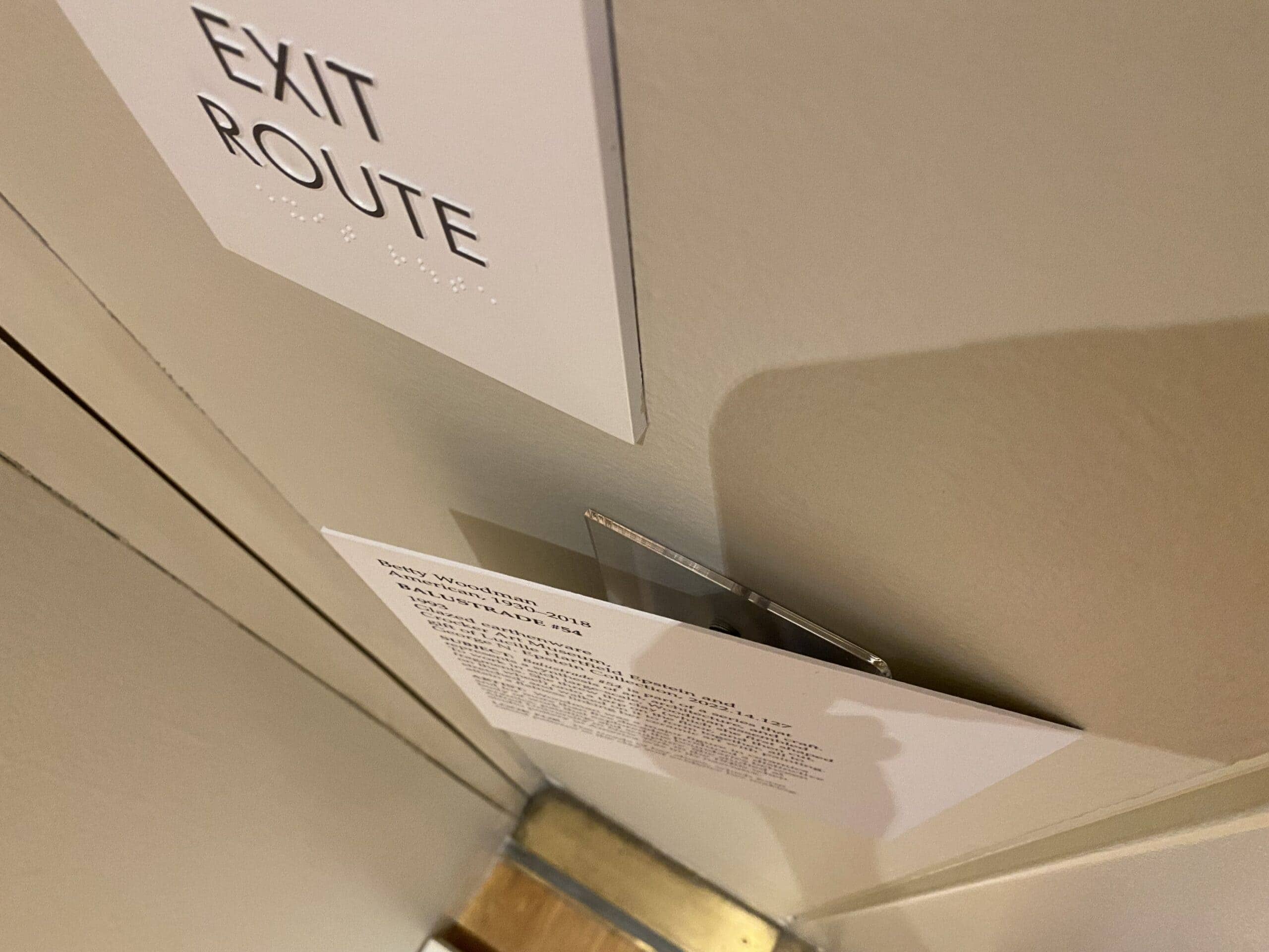
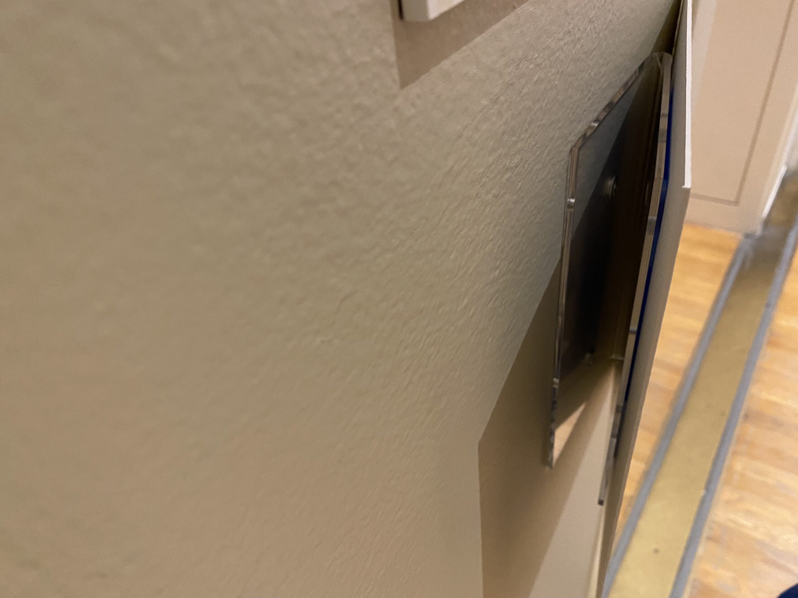
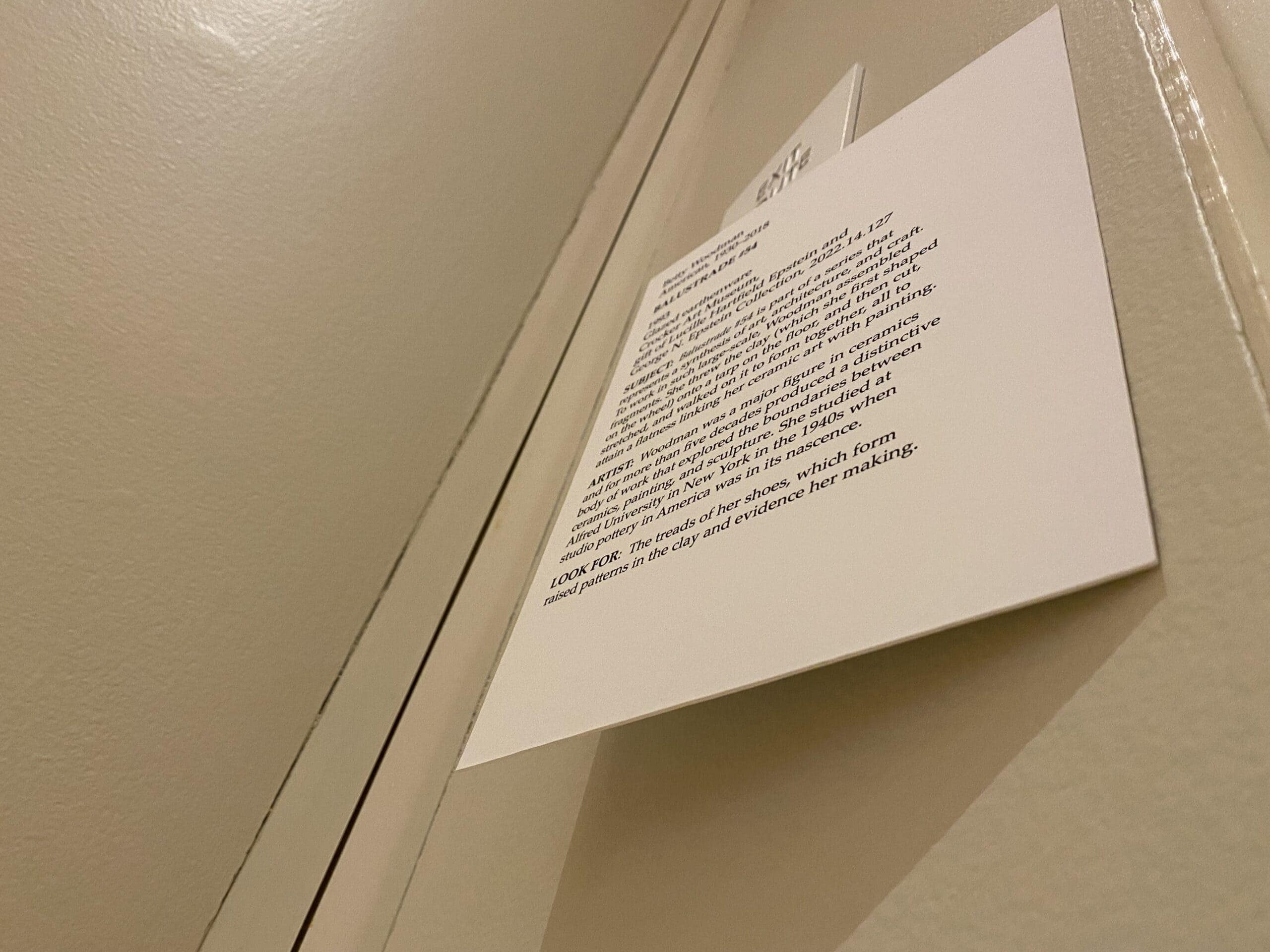
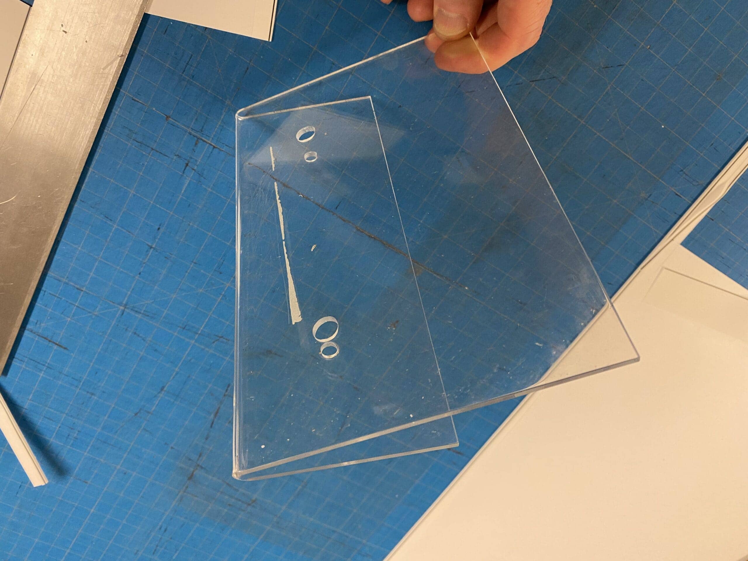
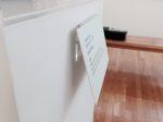
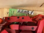
Label placement can be tough sometimes. Have you ever had to change its color or redesign the layout because you realized that there wasn’t room for the label or that it was just not in a logical spot? we had this instance where a nearby perpendicular wall was going to work ok for our new Betty Woodman installation. It was just slightly less than ideal. We have these bent pieces of plexiglass we use for cases that are not near walls. They give the labels a little kick up toward the viewer’s eye. We took one of those and put it on its edge to kick out in a new direction. This is a brand new innovation and it happened today. See what you think.
DIMS
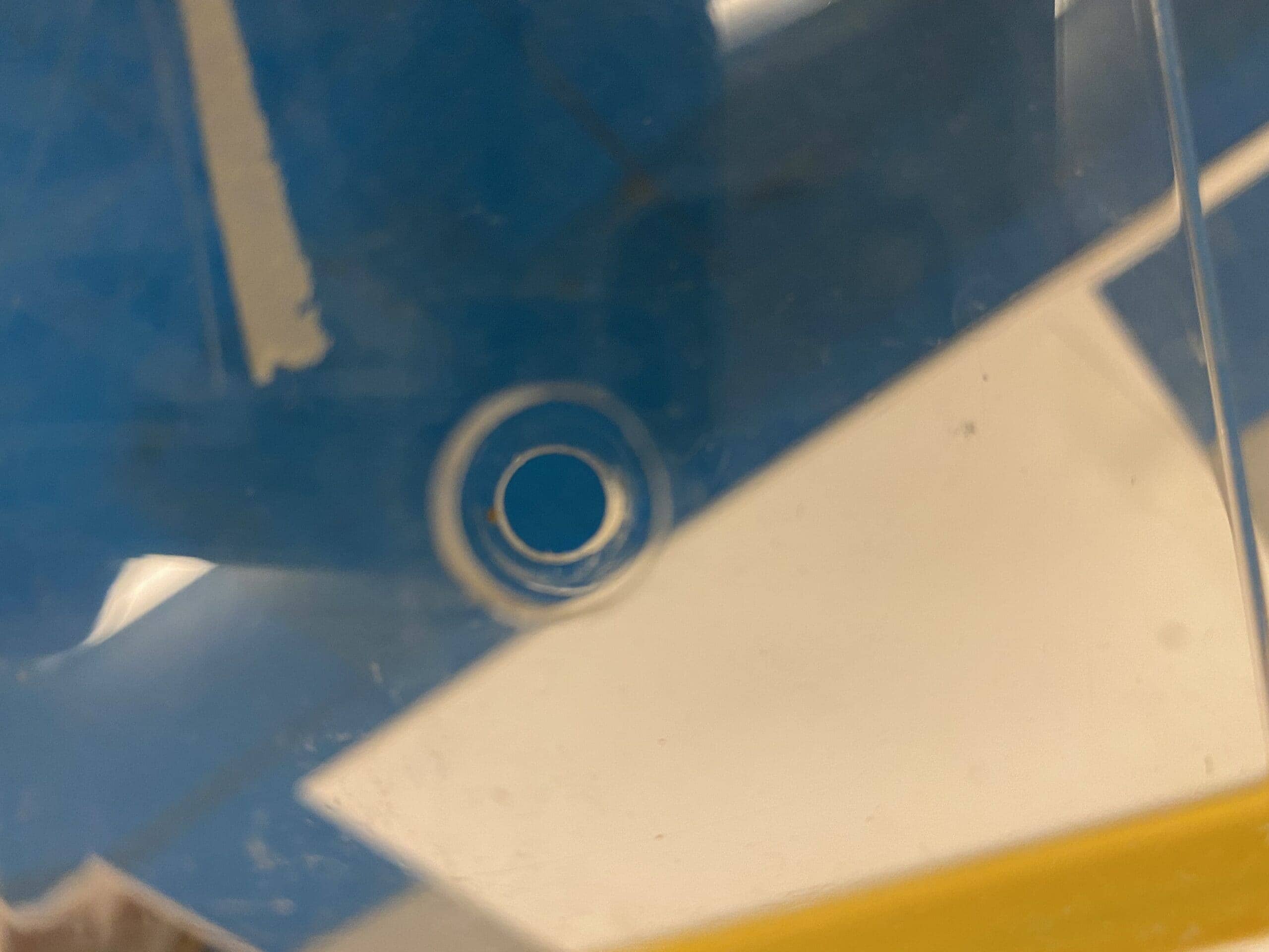
For refernece, the plex is 5.5″(face) x 8.25″(wide) x 3″ (return). The widest opening betwen the front and back is 1″. The holes are not the same. The front are 3/8″ so we can get our drill with extension bit in. The back hole is 1/4″ so a pan head screweasily catches the plex and doesn’t pass through. I suppose they could both be 3/8″, but it would be sloppier.
