The Cases
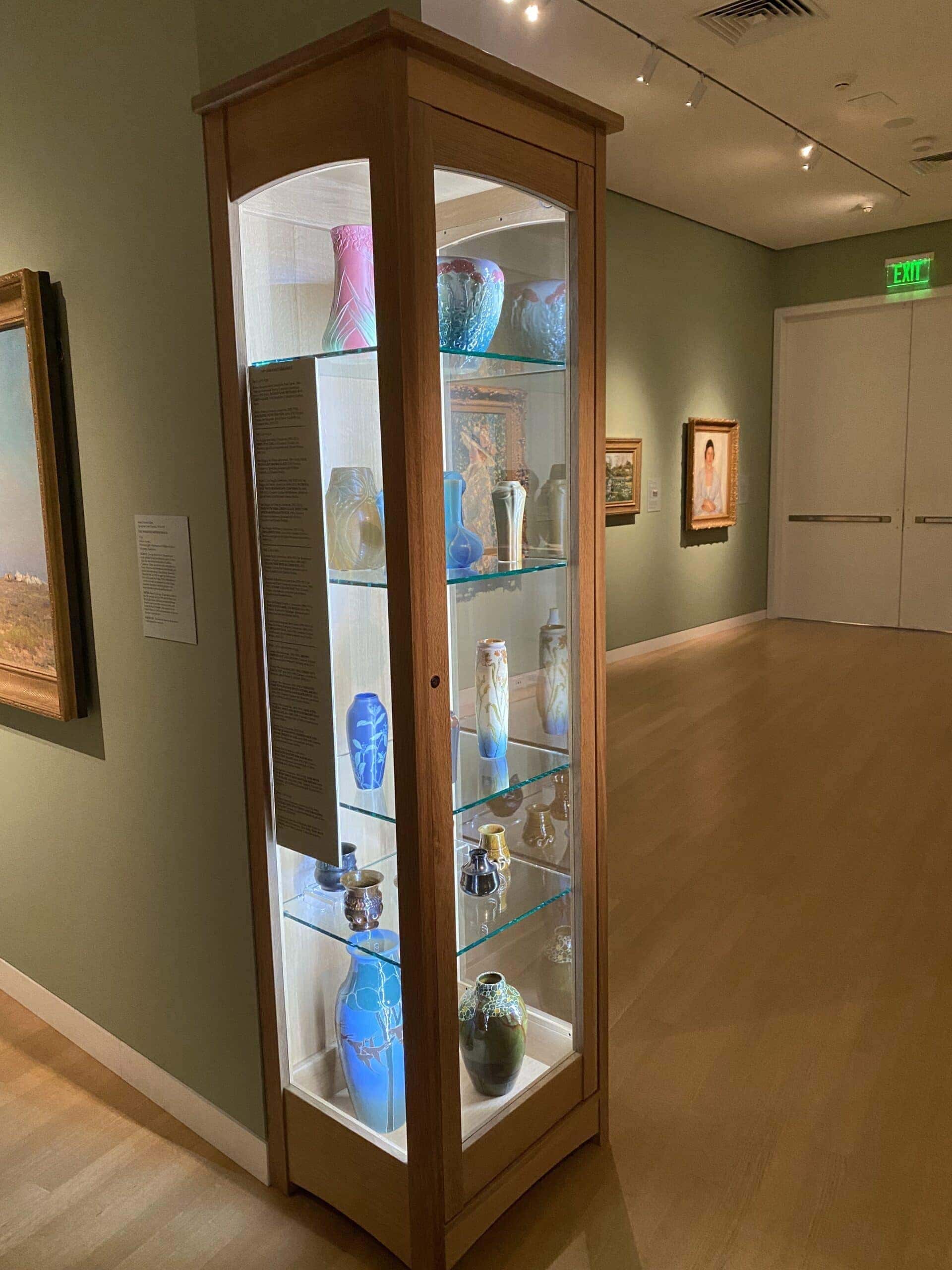
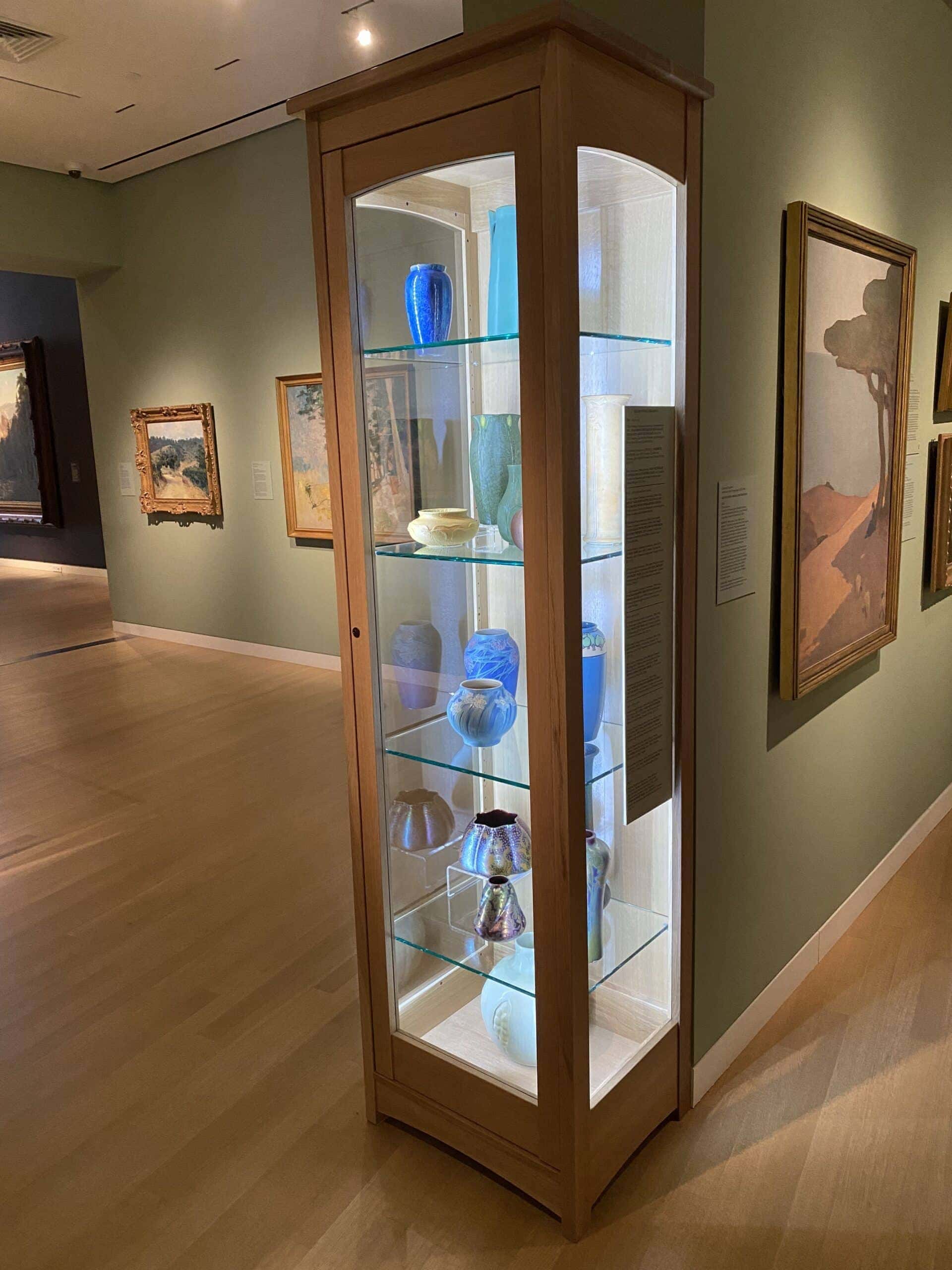
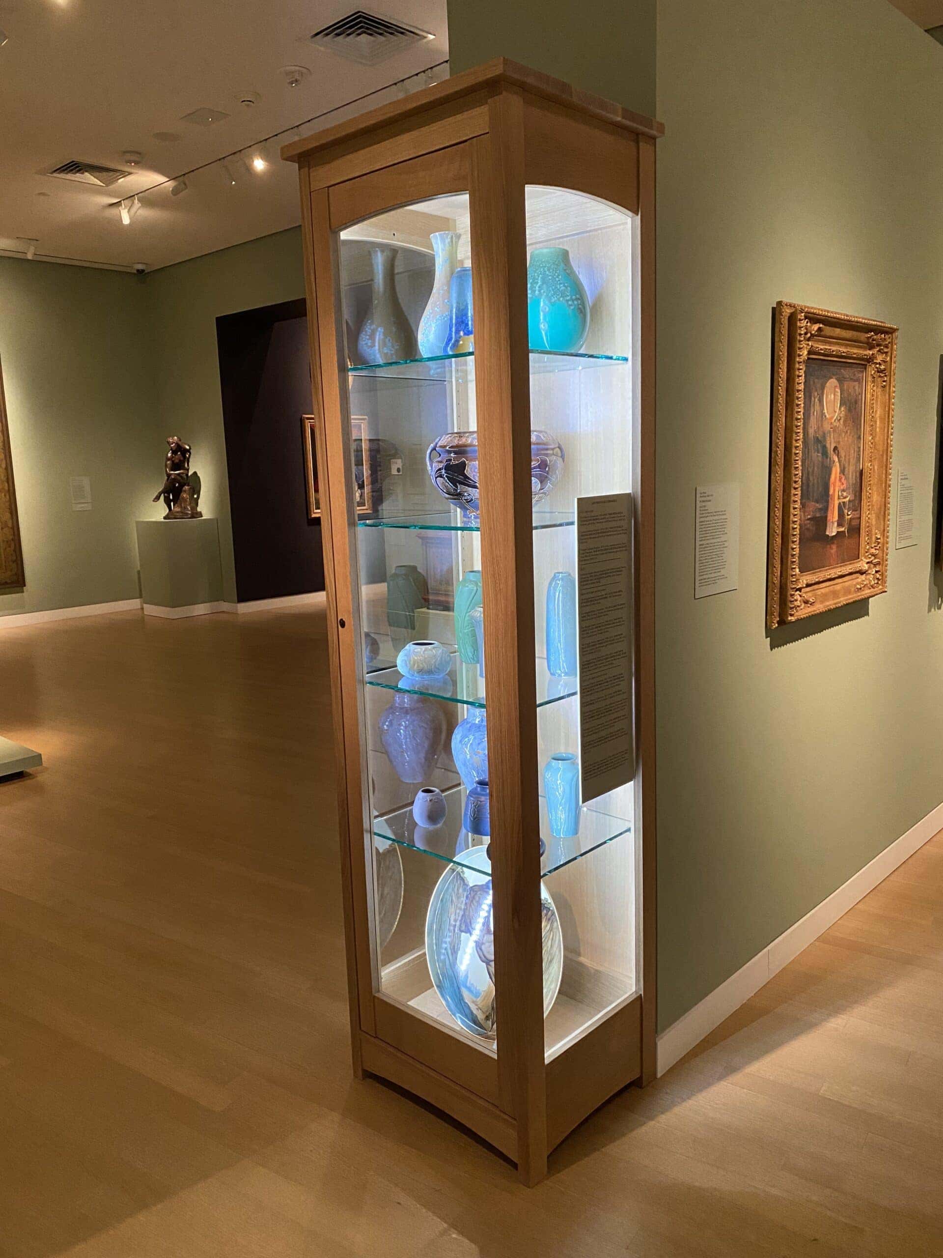
Hey there, museum trade-folk, designers, preparators, handlers, and technicians. Welcome back to another article, this is a case study for how we put museum object labels on the outside of a glass cases. It’s in the Crocker Art Museum’s Arts and Crafts exhibit area (gallery 315 to us) and it’s in a custom fabricated wood cabinet. Dugan did an AMAZING job, check out his breakdown on building these cabinet below! We had just two feet in width (that’s the width of the end cap of the walls) and could only really make them about seven feet high. They’re cute cabinets, perfect for the work, but there wasn’t room for labels nearby or in the cases, so we opted to install the labels outside on the glass. It’s not the best. It’s not the worst. It works. There’s a lot in the case and the labels are really long, the longest one was like 44 inches, I think. The shortest was maybe 32 inches.
The Cases
The Labels
So we did our standard print on 3M’s 3555 material (basically a decal produced on a latex printer) and mounted them to matboard and used white double stick tape to adhere that to the outside of the glass. I did it this way in the interest of time and on the off chance that it would look OK. It did not, but I had a second plan in my back pocket. And so here you can see it’s just distracting from the work in the case and so, as I always knew, our choice would be to back it with another piece of matboard as a backer. Why didn’t you do all of this backer from the start you ask, well of course we didn’t have the label copy ready when the work was ready.
The Layout
It was one of these COVID era things that we kind of fit in between other things. We got halfway and then we put it down, boxes and packing materials were left here and there. And then a month later we came back to it, but didn’t finish. Then the curator remembered another couple pieces he wanted to see as options that we had to hunt down (then didn’t use). So when it was officially done (works puttied down) we had a choice, we could mark all the locations, take everything out OR we could slip in these rather long labels with the works in place, We opted for the slip in place process.
The Install
-SPACERS-
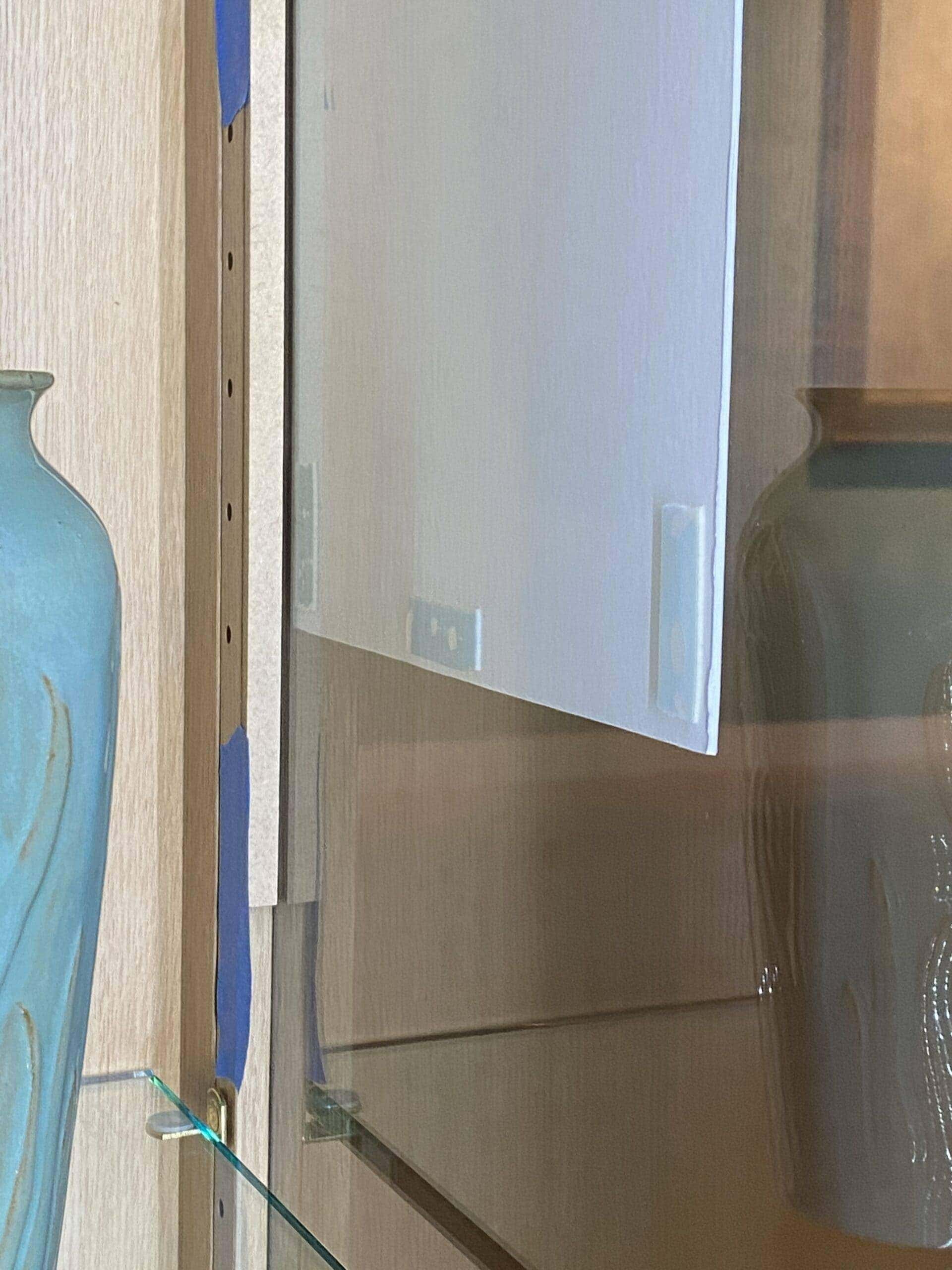
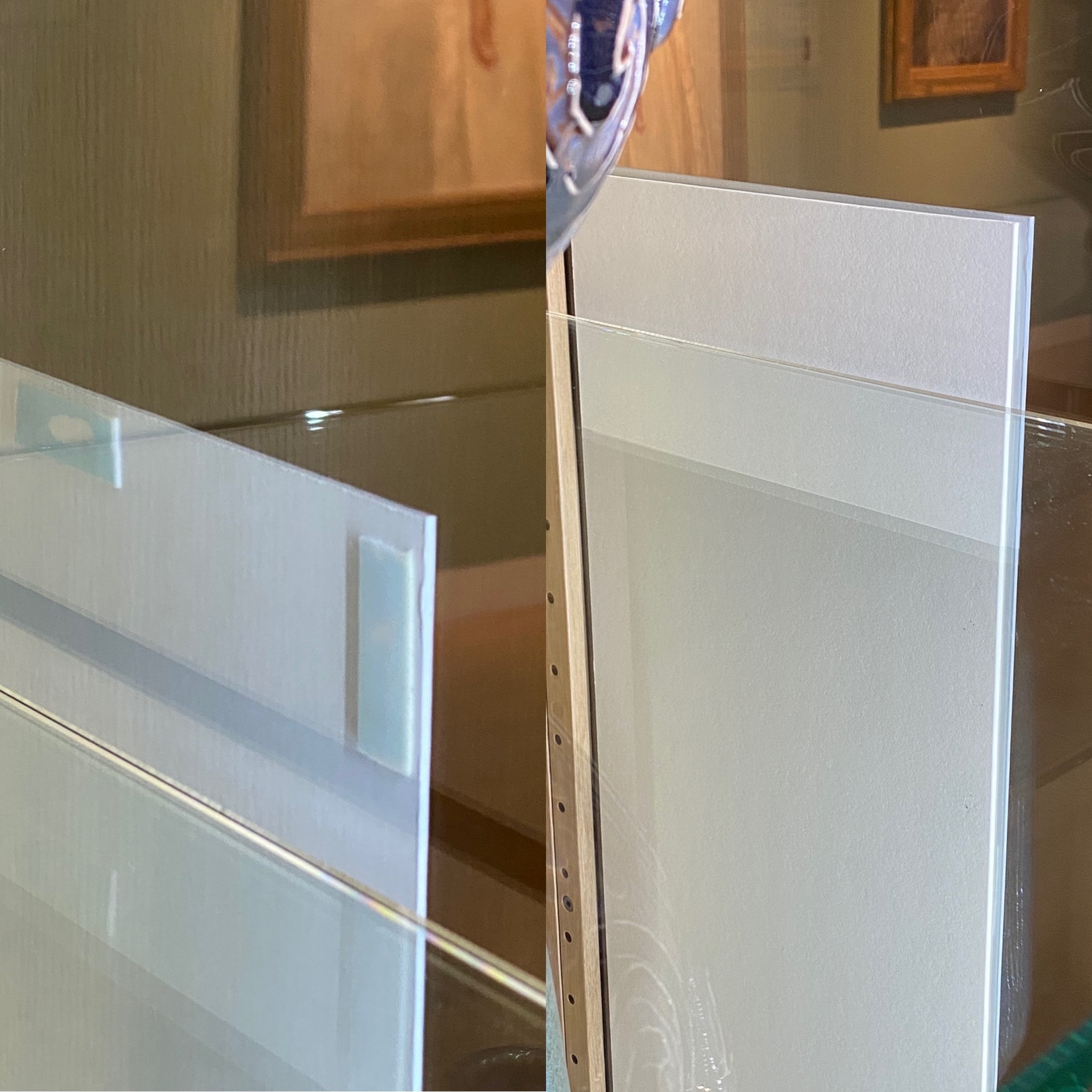
Jumping back a moment, here’s an image of the technique we use on the label on the outside, and it was brought to the inside so the two pieces of matboard matted well. It is a little quarter inch piece of MDF taped in place with blue painters tape. When looking at the (extra-long) finished labels butt up against the wood of the case it felt too crowded, but a little ¼” gap solved that feeling.
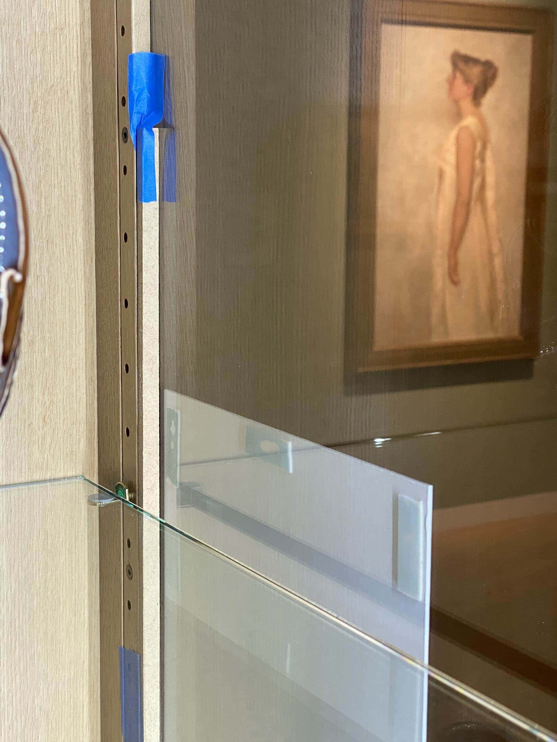
So as you can see, I did this little ¼” buffer inside the case and it extends two shelves or one shelf here in the picture, but the labels all extended past 2 shelves (because it needed to be extra hard right?). So it was difficult. But anyway, so this is the spacer we’re going to use to get it exactly spaced over from the edge of the wood like the one on the outside. And oh, another quick tip, we used a creamier colored matboard, an antique white, for the inside because it matched this arts and crafts cabinet better.
-ATG TAPE, YUMMY-
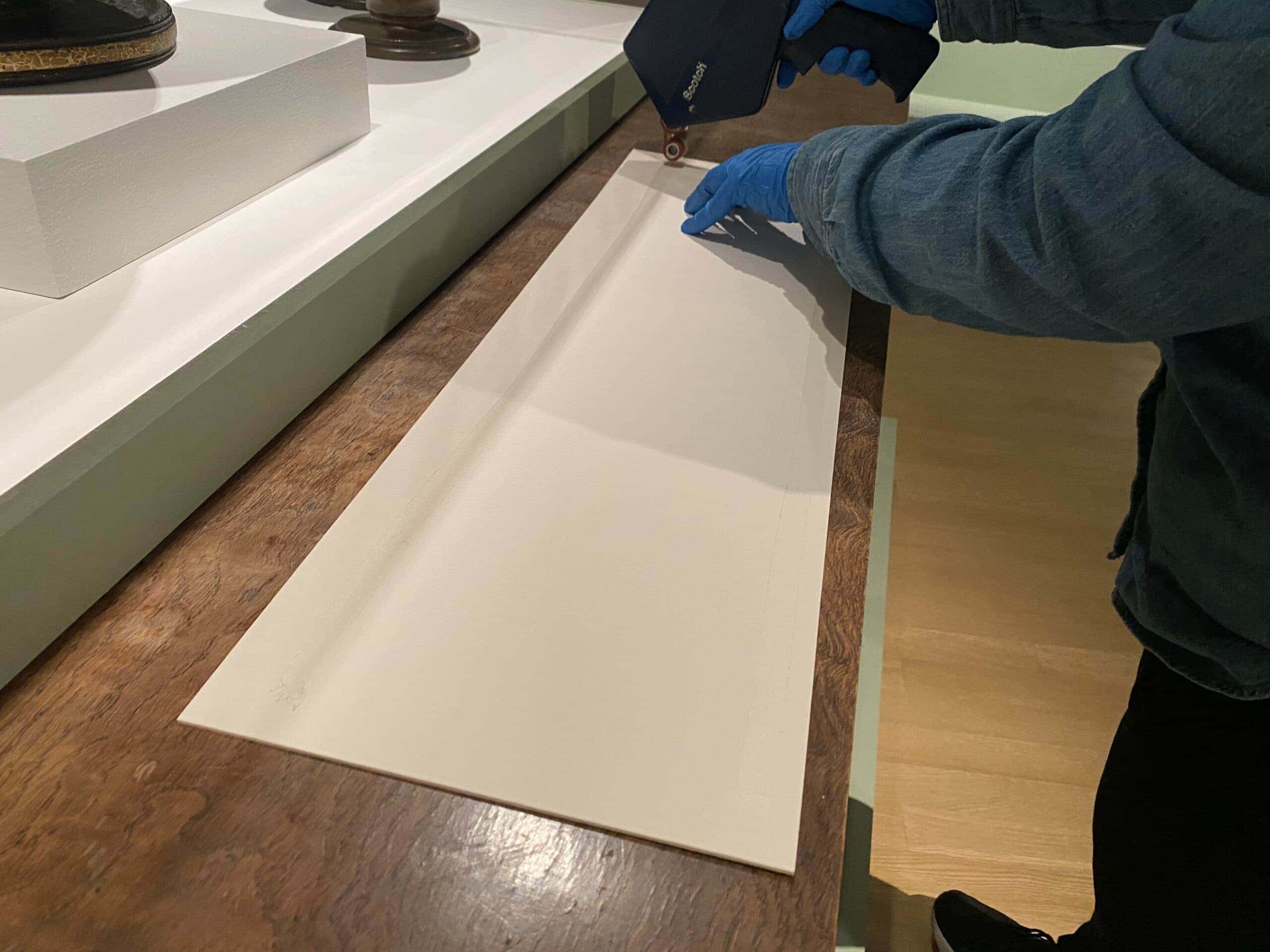
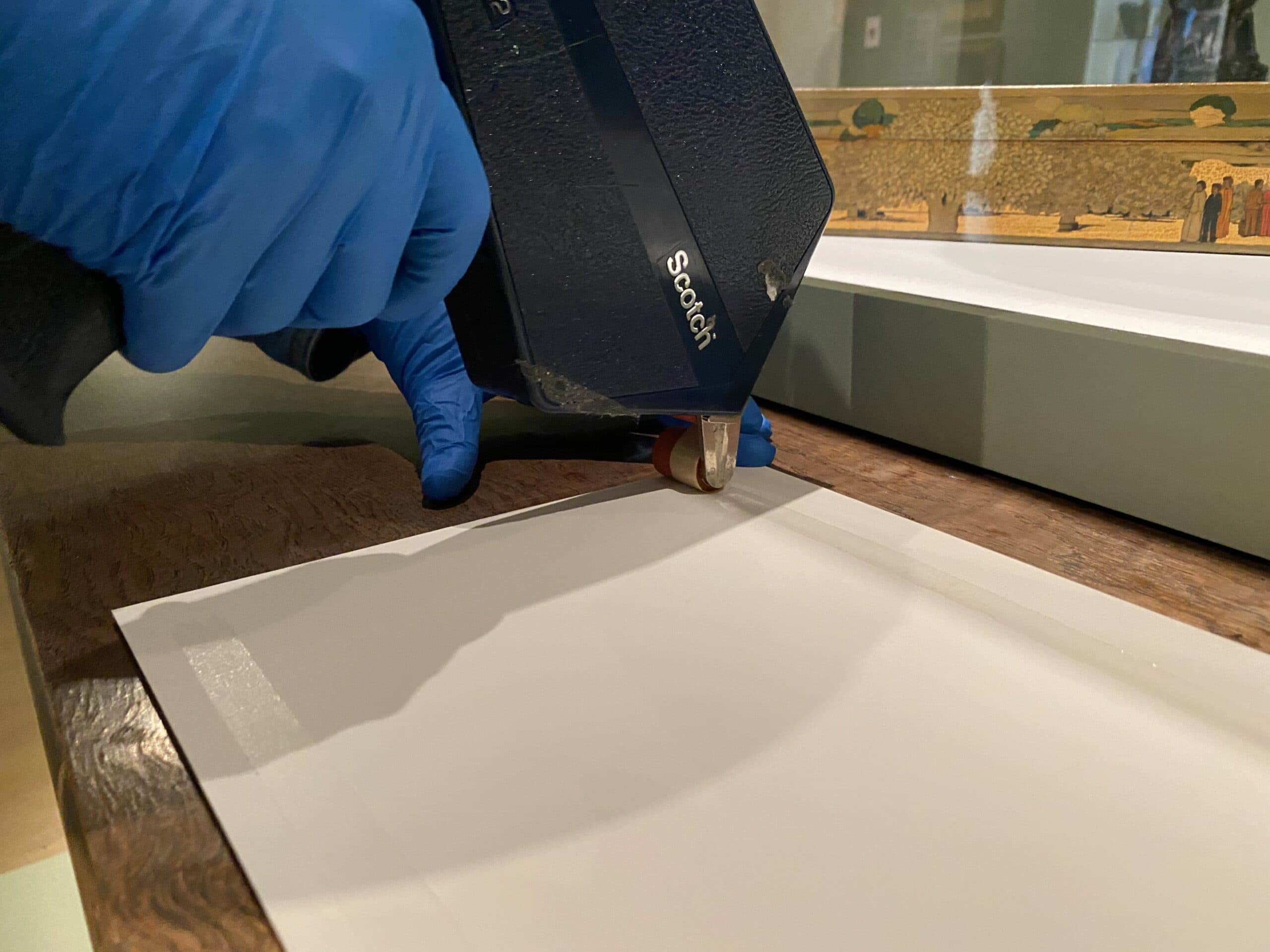
I’m blanking on the wood species right now, but it’s a nice hardwood. Here we have Jesse applying some ATG tape, her very favorite tape that she introduced me to years ago. It puts on a very thin tape, sticky and thin tape, beautiful stuff. This backer has to pass by two shelves and each of the three cases had a different approach for this backer board.
-CURVED INTO PLACE-
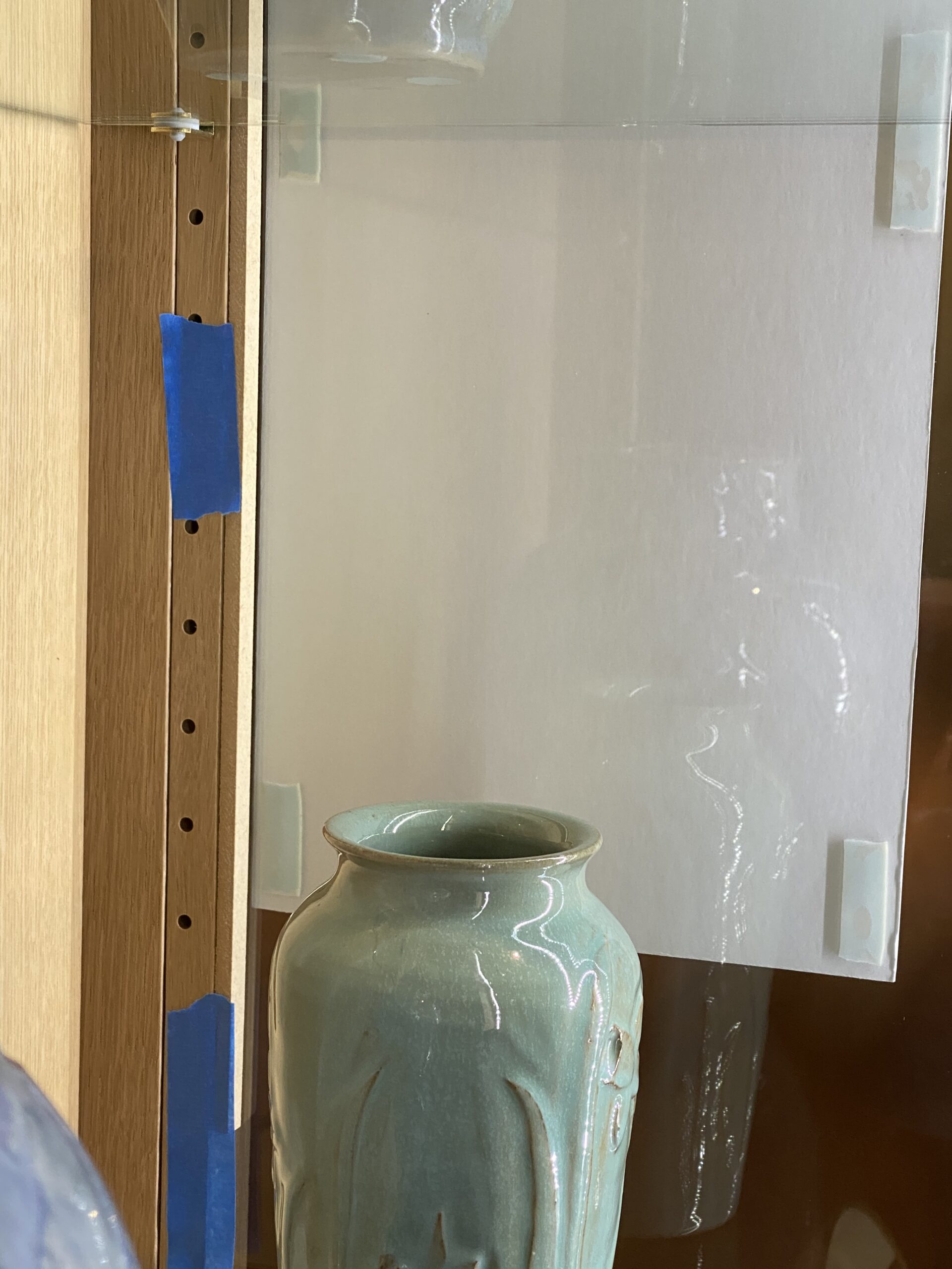
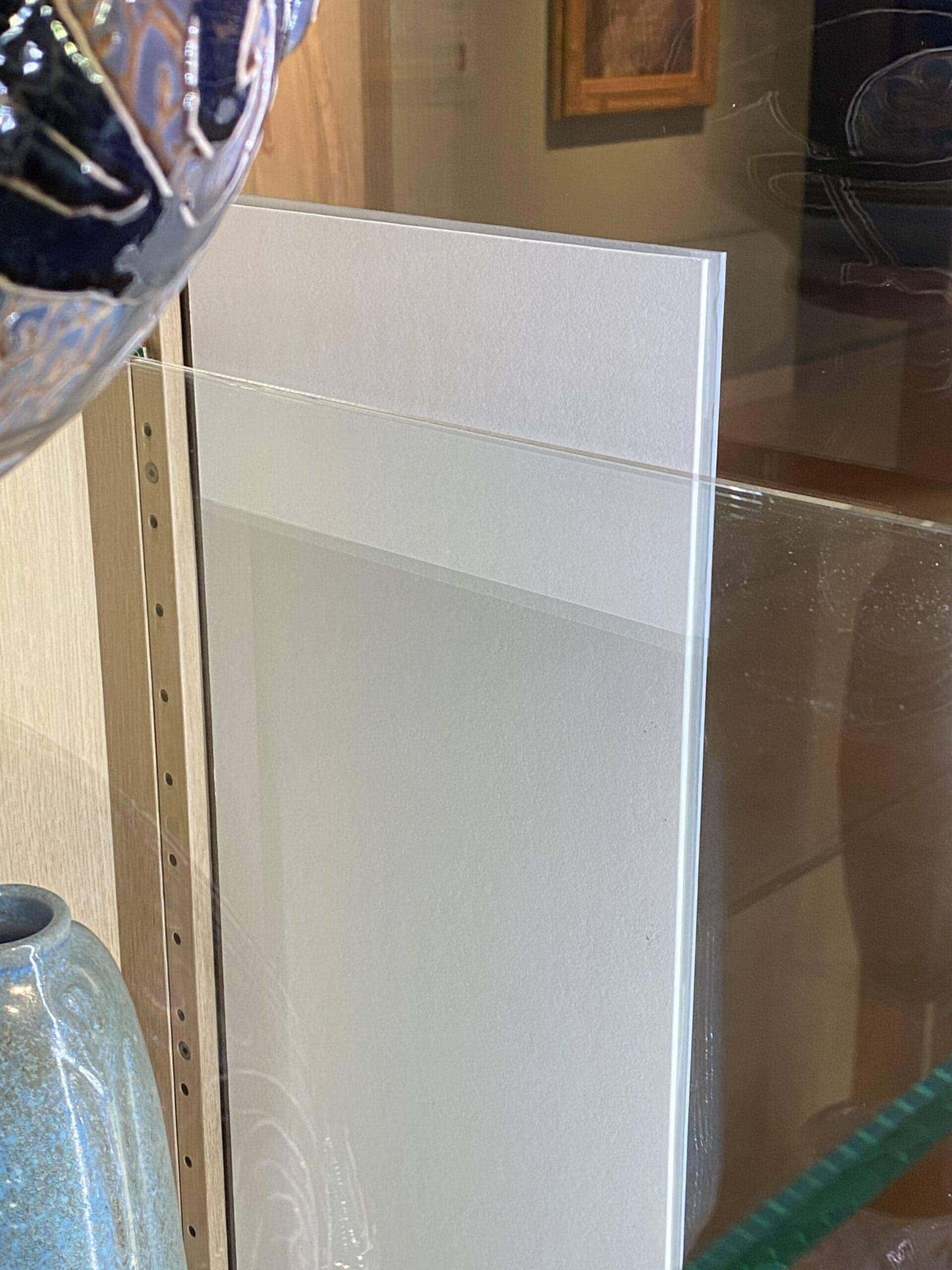
So obviously, it has to kind of curve away and kind of arch over the glass shelf, but also has to stay away from the works as well. We did a dry run before the ATG to figure out how it comes up and then back down, or up and through and arch this way and that, paying close attention to the position of my hands so as to not bump the works yet staying away from the glass until in the final position. The backer not only has to NOT bump the works, but also has NOT stick to the glass. It was a little hairy. This was a two person operation, Jesse sighted the height of the backer and told me to go a little up, then a little down, the stick it.
I don’t feel like it was dangerous for the works. It was just unnerving and it worked. It did. But God help us if we have to change the labels. We could easily change out the outside labels IF the content stayed the same. But if we added more than one object or a credit line went longer we’d have to change out the inside backer. We’d definitely have to take everything out at that point. I wouldn’t want to pull on the ATG and have something give way suddenly. But I suspect this case will stay this way for a while.
The Failure
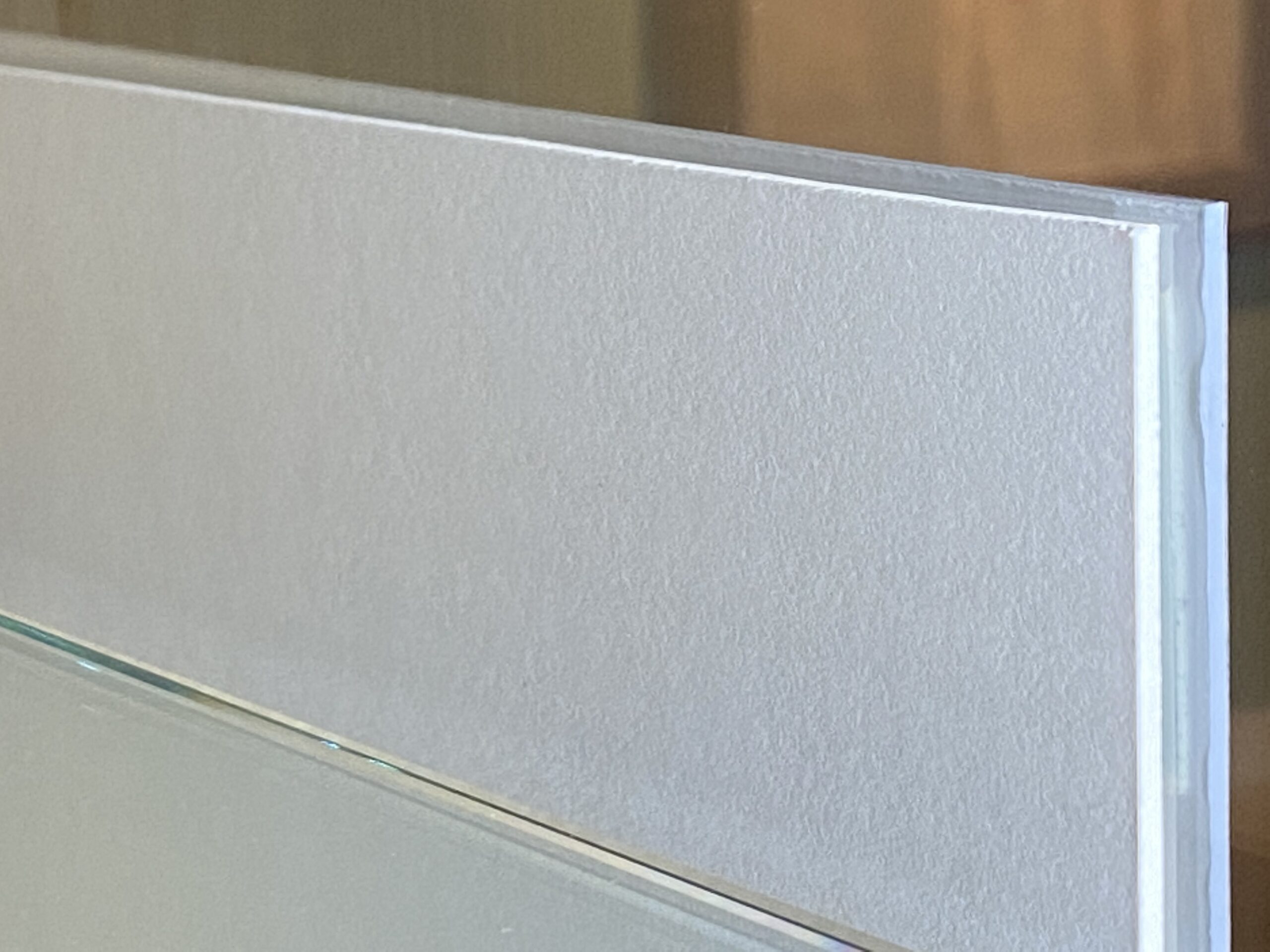
Now full disclosure, they weren’t perfect. You can see the way the two pieces are matted up here. It’s a little wider and taller. The height is more manageable because you can hide the discrepancy at the bottom where no one will quite notice it, but the width, oh the width…it is not perfect. You know of course, there’s going to be a gap because it has double stick tape on one side and that’s going to just sit up higher and you’re going to see the back, which is why we didn’t use foam tape on the inside. We didn’t want even more distance there. But still, it’s not perfect.
Next Time
If I had to do it over, which hopefully I won’t, I would have traced the label after it was mounted and then cut that tracing rather than taking dimensions and cutting it from that measurement. Also, maybe I wouldn’t have used foam tape on the outside? It’s pretty sticky stuff. Maybe I thought it would be a cleaner change out down the road… I’m not sure. Thinking now about it, I wonder what it would have looked like to mount the 3555 material to antique white and then ATG it on the glass and not use a backer at all. There’s a solid 35% chance that could have looked ok.
In any case, matting these two pieces just didn’t work. It wasn’t perfect. I think you guys would see this little hiccup if you were in our museum, but I don’t think anybody else really notices. And to be fair, the angle of this shot is contributing to the lack of alignment.. Here’s a close up of it, that matting is my biggest regret on this one. I think we’re successful in a lot of the things we do. But we also have failures and we have things we would do differently. And so, if we’re not noticing these things or talking about them, then we can’t learn together. I really love talking about failures. I love to get it done better. I love getting better. I love refining it. The matting of this label is a bit glaring for my taste, but now you know what happened. So there you go. I’m going to share it so you can avoid it next time.
Before and After
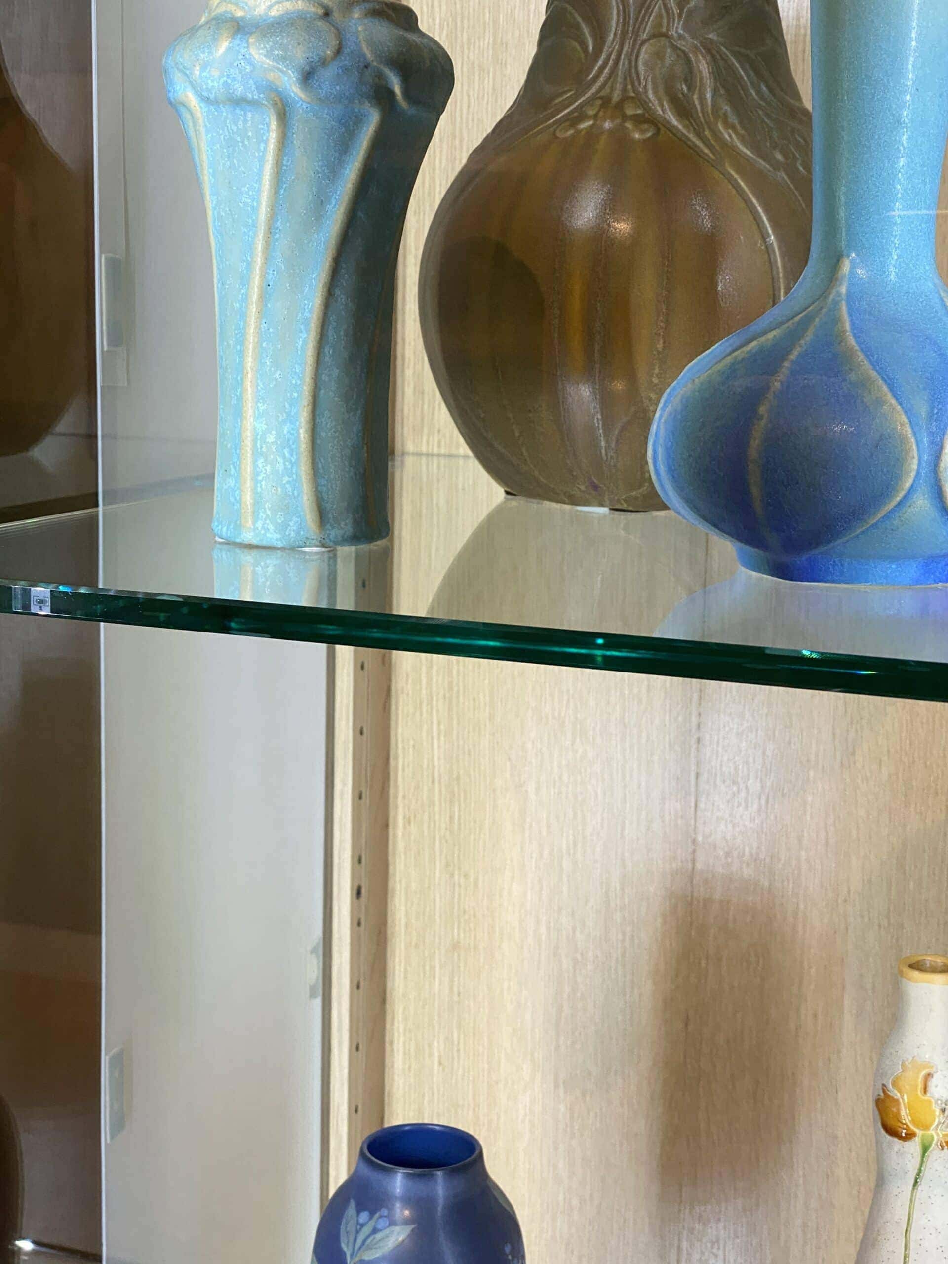
To finish up, here’s a nice before and then after the backer, it helps a ton and I think it makes the most of the situation. From afar the labels are present. They clearly are, but it’s not the worst. And, like I said, there weren’t a lot of choices. Taking out works and replacing them with a label is an option, but not a great one. In this particular picture, we could have taken out that purple piece in the front, the one with the pink flowers. But then you have shelves higher up where the labels would then block views of the other works. It just kind of can’t go in the case and can’t go anywhere nearby. I mean, I suppose we could put some kind of floor stand. That would be another solution, and maybe if we have to redo this, we’ll run a test and put up something on the floor and say, which do we like better? Bottom line, nobody seems to be complaining at this point. That’s always good. That’s not always a given. Not the curator, not the visitor. So it is. And so it’s done, for now. And hopefully you guys saw a bit of a technique there and somebody somewhere is going to be challenged with a similar situation as unique as it is. So I wish you guys the best, and all the creativity in the world, and be well out there. All right, let’s get better together.
Dugan’s Cabinet
He put so much thought and care into the construction of these babies. They’re impressive in person, but when you watch this video you’ll love them even more! C’mon by and check em out for yourself…
Stay Tuned
Dugan will be making another set of cabinets and I’ll break down what we changed for the lighting inside. I’ll put the link here when that’s complete. Sometime in 2021.
Ciao,
Matt

